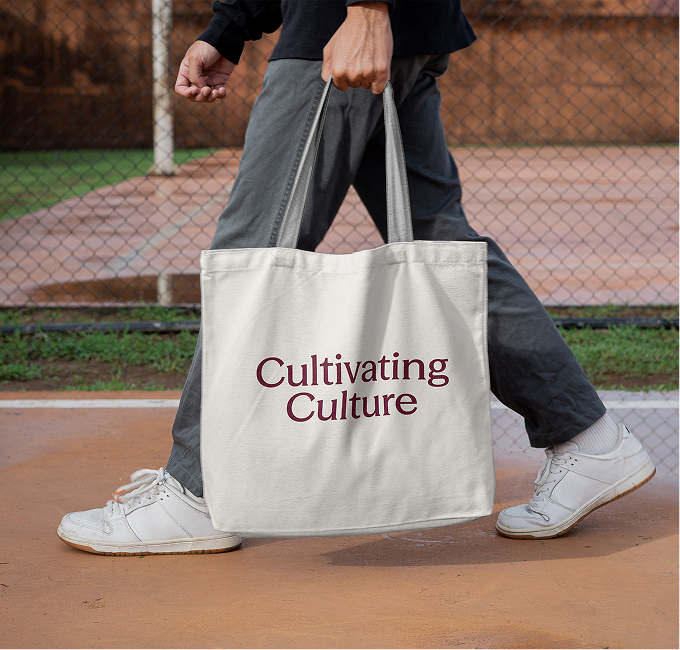
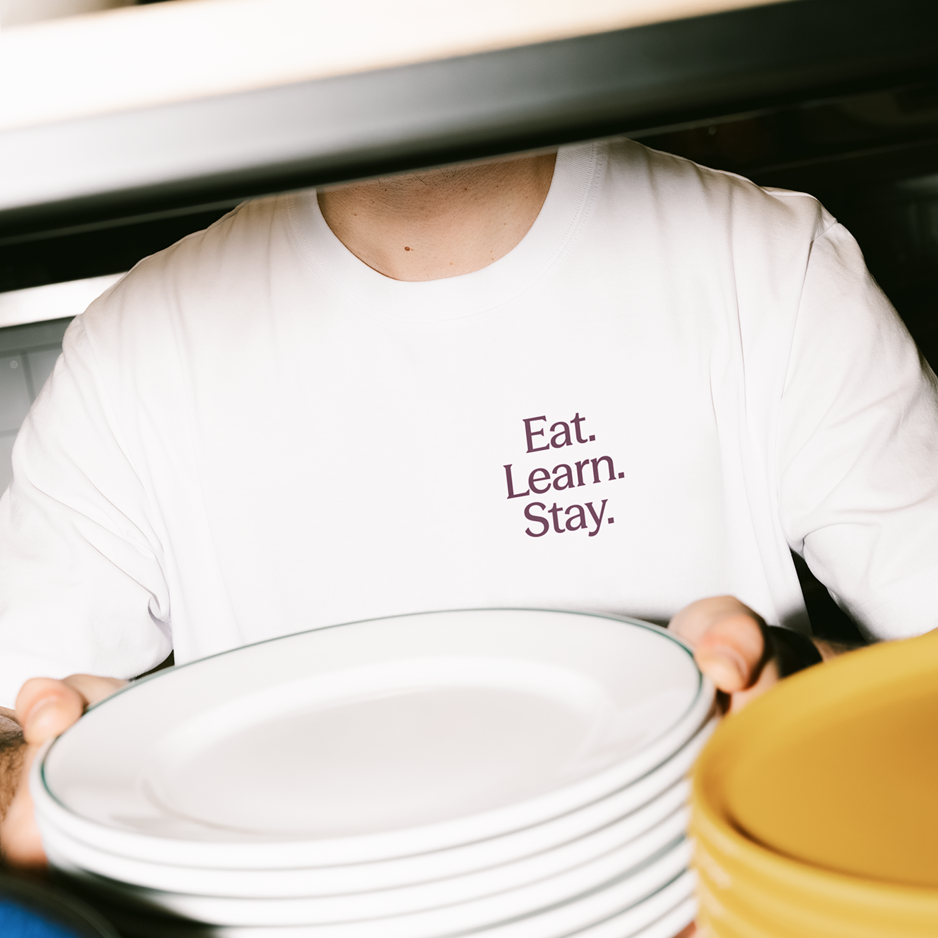
Eat. Learn. Stay is our philosophy touchpoint. Not a tagline sitting on top of the offer but actually the offer itself. This in turn gave us a rhythm for the copy, a structure for the site, and a promise that sticks, something anyone could repeat and remember.
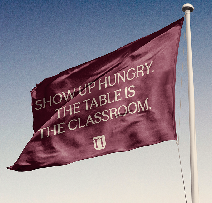
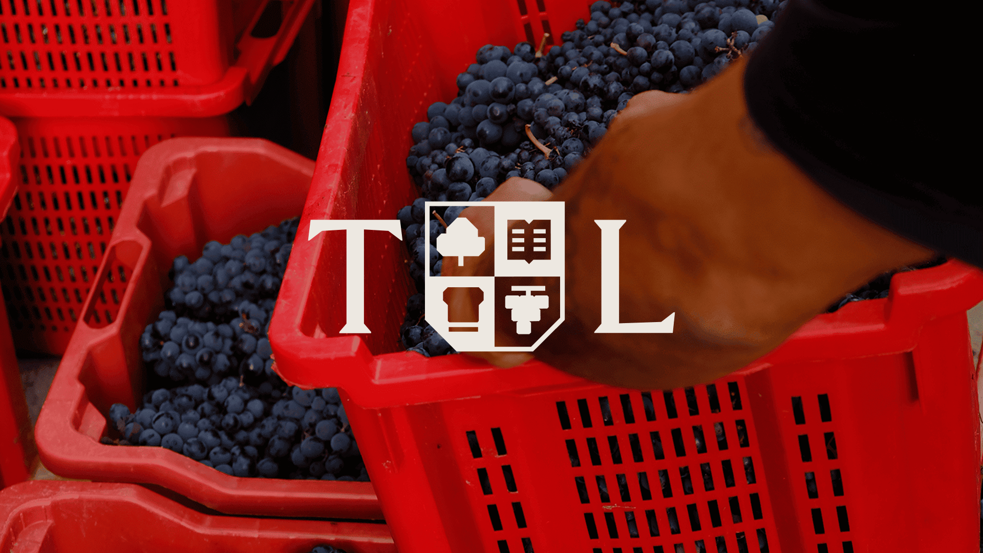
The logo was meticulously designed to integrate seamlessly with the brand's identity, ensuring it weaves through various mediums rather than merely occupying a static position above them.
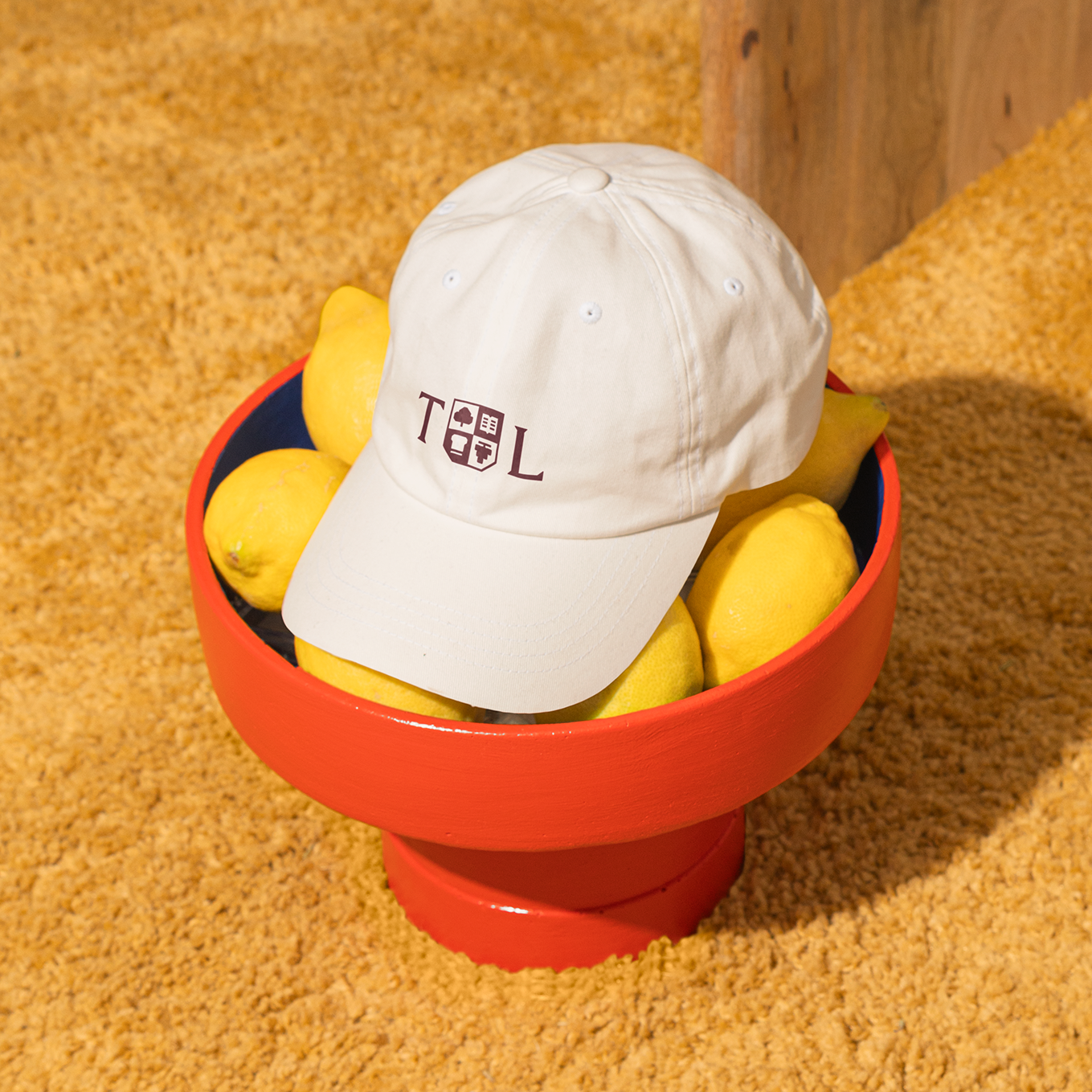
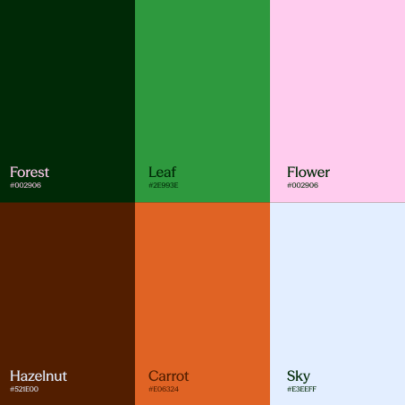
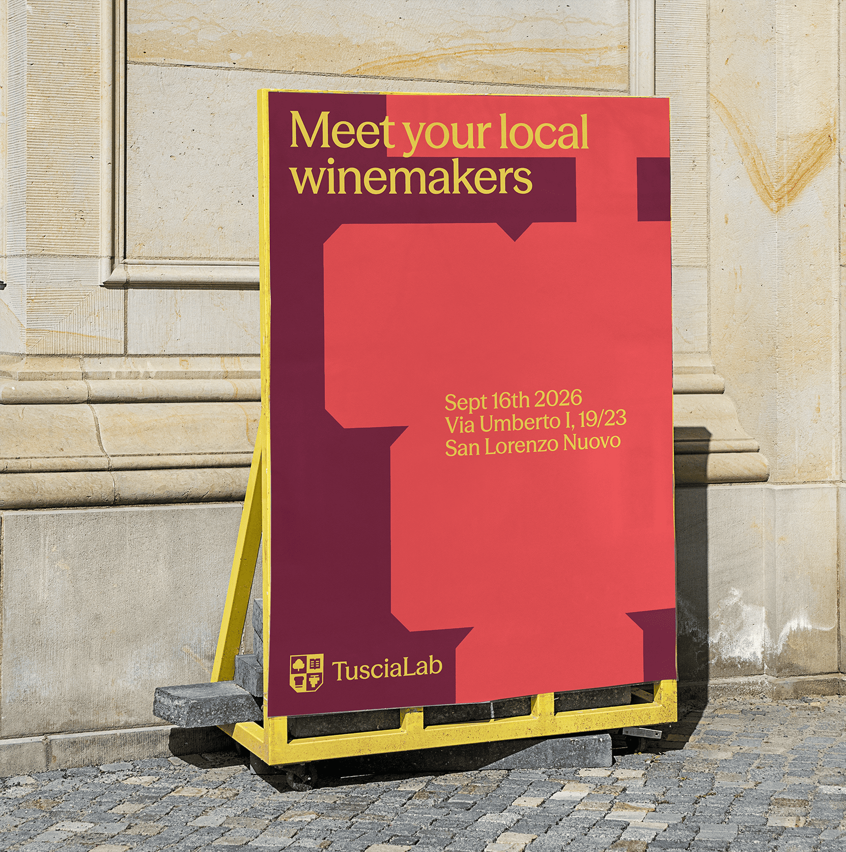
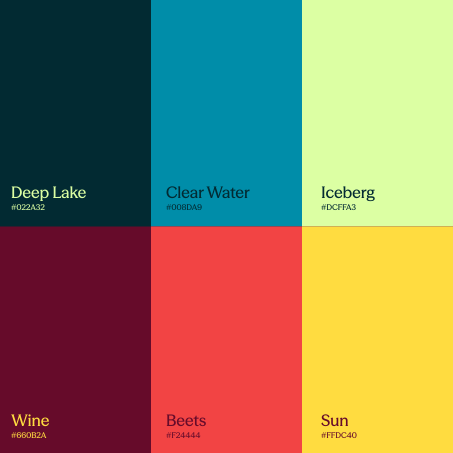
Color carries meaning. A primary duo of Wine and Cloud for the brand, and four secondary families that each stand for one side of the business. Drawn from the hills, lake, and vines, they tell the audience which part of Tuscia they’re in before reading a word.
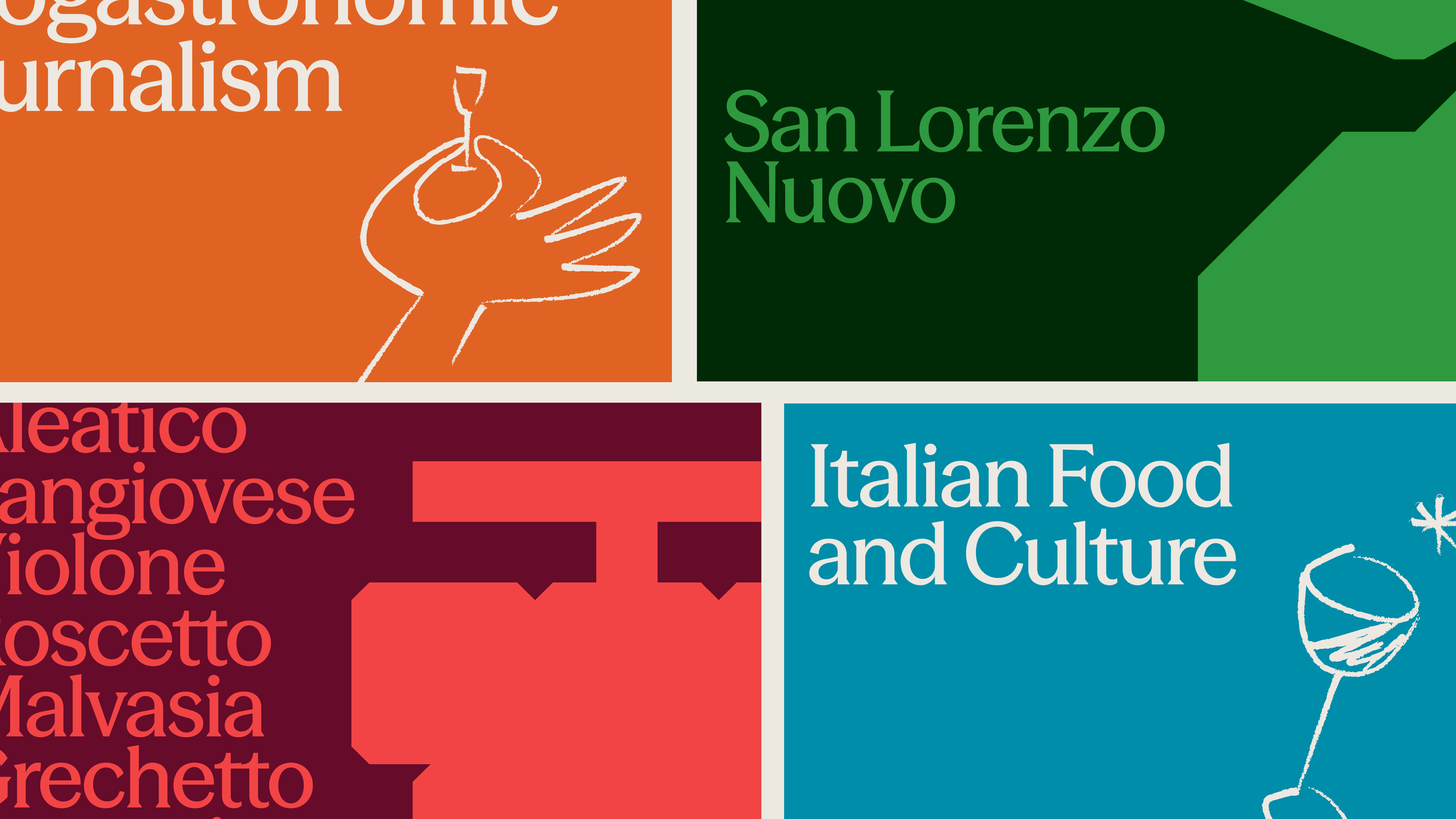
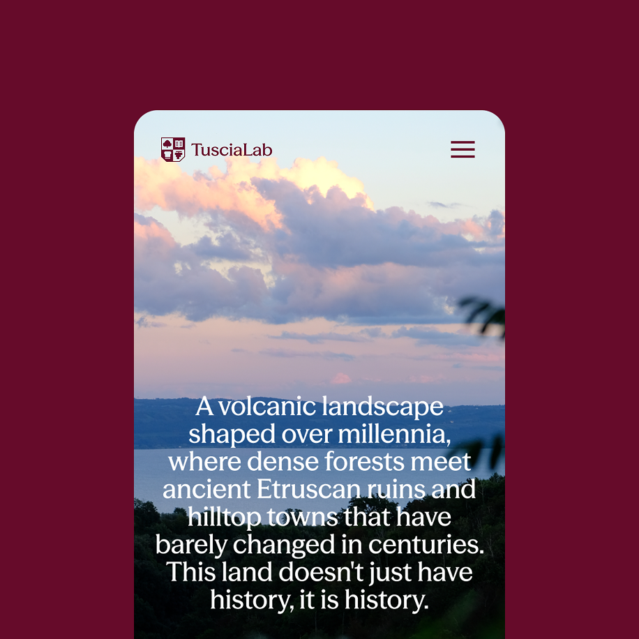
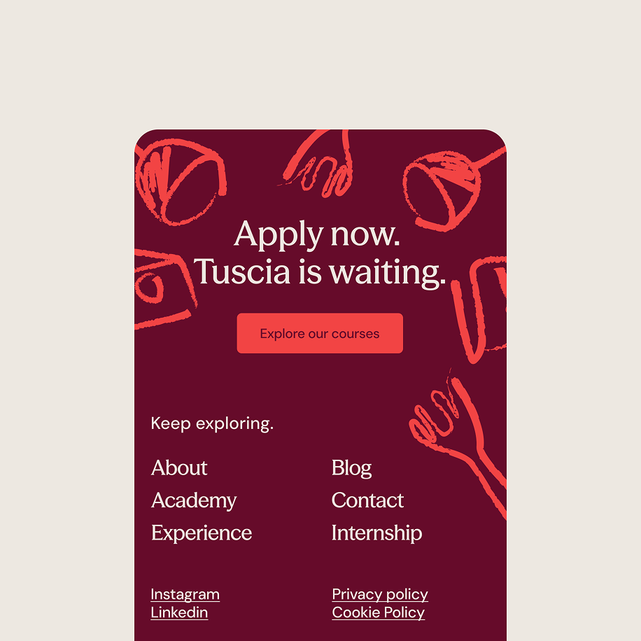
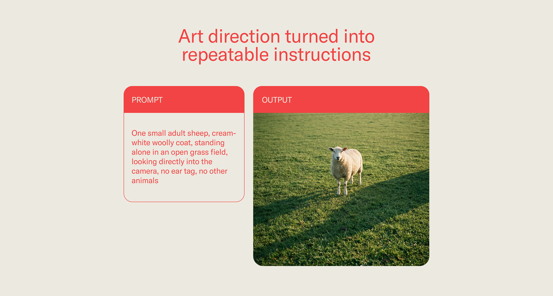
The website is built as scrollytelling: the story unfolds as you scroll, with transitions carrying you from one part of the territory to the next. Behind it, our AI image framework lets the business produce on-brand imagery on demand, without a new shoot for every course, dish, or season.